Quick Assessment of Your Knowledge of Variation
By Timothy J. Clark
Updated Mar 18, 2024
The following six people were selected and trained to perform a specific series of tasks over four days.
They received the same amount of training, were given the same equipment and materials to perform the tasks, were provided with comfortable working conditions, and were adequately supervised.
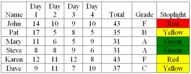
You want to recognize and encourage the top performers (the lower the number the better) with the intent of maintaining and improving performance. Below are the results.
Performance Report – Who are the top performers?

If this process represented the cumulative results of wrong answers on a daily 50-question test in school and the teacher was grading on the curve, the distribution of grades would be 30-32 = A, 33-35 = B, 36-38 = C, 39-41 = D and 42-44=F. A column that provides status by color codes is also provided to help assess performance.
Who would you select as the top performer (s)?
Wrong Answer: Applying the traditional view of variation, choosing the “top performers” – those with lower numbers or higher grades, would be the wrong answer.
The Right Answer. Applying the new perspective on variation, the correct answer is that based on the results, there is no significant difference between the people performing the tasks, or in other words, there are no top performers. The variation in their performance is normal or common. Taking action, such as recognizing “top performers,” represents tampering – spending time or money on a non-valued added action, which tends to make things worse and not better and reinforces the status quo. (Personal Story: Are Grades Effective and Fair?
Explanation
Since the outcomes from the process represent common causes of variation, the process is stable or predictable. In other words, If you always do what you always did, on average, you will usually get what you always got. Stable does not necessarily mean good, it just means that given all of the variables, results from the process are predictable. Other terms for a stable process would be routine and habit.
Imagine tracking the amount of time it takes you to brush your teeth every day. Would it even occur to you to reward yourself for a “top performance”?
If you want to improve the result of any process, you must make a permanent and fundamental change. Indications of special cause variation would provide feedback on the results of the change. For example, fad diets can represent tampering. They often result in temporary weight loss but often do not result in a fundamental change in diet and exercise routines.
Applying Some New Methods
These methods can be applied to assess the results from any system or process (habit, routine) that can settle into a steady state. Media headlines that refer to numerical information provide another source of examples. Most of the headlines are misleading if not totally wrong. Application examples could include:
- Sports: Basketball Free Through Shooting, American Football Field Goal Kicking,
- National: Budget deficits, unemployment and employment rates, crime statistics, suicide rates, health care access rates, car accidents
- Personal: Savings, individual weight, travel times.
USAFacts.org has examples of trends on national issues. When looking at the run charts, try to visualize the centerline (median) passing through the middle of all the points and determining if things are getting better, worse, or staying about the same.
Identifying the two causes of variation – Run Chart
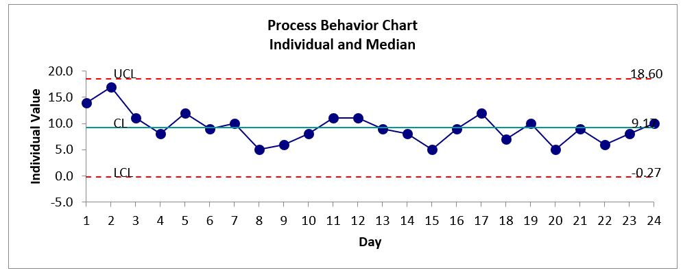
The data from the Performance Report above is plotted below on a run chart and identifies that the variation only includes common causes. A run chart is a line graph of data plotted over time. Generally, 20-25 data points are needed to arrive at an accurate judgment. The Center Line (CL) can be calculated using the average or median. In this case, the median was used. The median is the value separating the higher half of the data from the lower half. For instance, if you were to plot the results from a personal routine or habit, such as the time it would take to commute to school, work, a friend or relative’s house, or your favorite store, the results may look similar to the chart below.

Indications of Special Causes of Variation (1)
A special cause of variation could indicate a temporary or fleeting event or a change (positive or negative) in the process. Depending on the standard, the number of data points could range anywhere from 5-8 data points: Indicators of a shift in the process include the following:
- 6 Consecutive Points in a row rising or falling.
- 8 Consecutive Points in a row above or below the center line.
- Points (outliers) that appear farther away from the center line; A outlier could indicate a special cause of variation.
- Nonrandom patterns: too close or too far from the center line or repeating cycles. The people closest to the process may be able to explain the patterns.
Given that there are no indications of special causes, the variation is assessed to be common and the process is determined to be stable (predictable).
Note that the American Society for Quality (ASQ) supported the AIG standard (7 data points rising and following or 7 points above or below the average) for their K-12 Education prototype referred to as Koalaty Kid. (1)
An additional and more advanced tool that can be developed is a Control (Process Behavior) Chart. This is a run chart with upper and lower limits. In this example, the upper limit is 18.6 and the lower limit is zero. No points (outliers) fall outside the limits nor are there any nonrandom patterns or indications of cycles that would indicate a special cause. Control charts are not appropriate in all cases. In the case of COVID-related data, for example, run charts are a better tool to help identify how the respective process/system is performing.
The Control Chart or Process Behavior Chart (2) can also be called Statistical Process Control (SPC). It was developed by Walter Shewhart in 1924 and is accepted worldwide. The upper and lower limits are based on the Three Sigma limit. Three Sigma is the probability that 99.73% of all outcomes will fall within 3 standard deviations of the mean (above or below). Shewhart identified the three-sigma limit as the practical and economical limits upon which action should be taken. (3)

Conclusion
This example was inspired by Dr. Deming’s Red Bead Experiment. I had the opportunity to attend a four-day seminar conducted by Dr. Deming in 1988. I have conducted the experiment over 100 times and used pre and post-tests to illustrate the shift in thinking. The average score on the pre-test was a C. Everyone received an “A” on the post-test, but most likely, few, if any, adopted the new thinking. The experiment also reinforced observations by Winston Churchill:
- “Men occasionally stumble over the truth, but most of them pick themselves up and hurry off as if nothing had happened.”
- ‘United wishes and good will cannot overcome brute facts,’ ‘Truth is incontrovertible. Panic may resent it. Ignorance may deride it. Malice may distort it. But there it is.’
Deming spent about half the day on this exercise to reinforce the point that rewarding or punishing the “willing workers” did not improve the process and just demoralized them. The supporting videos are less than 10 minutes long.
Deming estimated that failure to understand the difference between common and special causes of variation resulted in decisions where 95% of changes could result in no improvement. For an individual example, consider New Year’s resolutions. What percent of your resolutions have been successful – how many have resulted in a permanent and fundamental improvement?
Deming also considered the common practice of annual performance appraisals (and grades in school) as one of the Seven Deadly Diseases of Management. See also the post: Are Grades Effective and Fair?
The Ghost of Quality Future. Most people are confused about what quality means. Hopefully, better education in the coming decades will correct this. by Anthony D, Burns, Jan 13, 2022
American Society for Quality (ASQ) – What is the Law of Variation?
Footnotes:
(1) The Ambiguous Control Chart Trend Rule, Jay Arthur, Quality Digest. Trend rules are helpful in service industries but you need to know which one to use
(2) Don Wheeler proposed updating the terms to be more descriptive including the name – Process Behavior Chart.
(3) “Dr. Donald Wheeler in his book Advanced Topics in Statistical Process Control, reinforced that the three sigma “limits” are not probability limits.…..it is important to remember that there are other considerations which were used by Shewhart in selecting this criterion….the strongest justification of three-sigma limits is the empirical evidence that the three sigma limits work well in practice – that they provide effective action limits when applied to real-world data.
